



Medical spa branding: logo, visual identity, and strategy that converts
Medical spa branding is the system of visual and verbal signals that shapes a prospective client's first impression of your practice. It covers your logo, color palette, typography, imagery, and the language you use consistently across every channel. Done well, it builds recognition before the first appointment and trust long after.
What elements should a spa visual identity include?
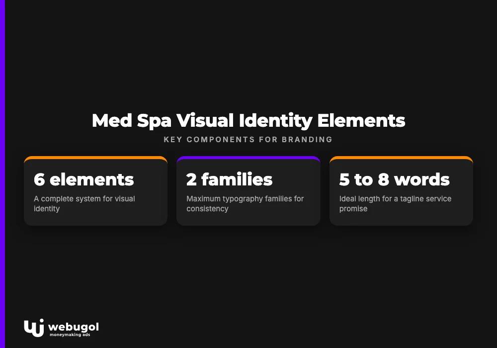
Every component of medical spa branding connects to the others. A spa visual identity is not just a logo; it is the complete system that shapes every impression your practice makes across digital and physical touchpoints.
| Element | Role | Common choices for med spas |
|---|---|---|
| Logo | Primary mark of recognition | Wordmark, lettermark, or icon + wordmark |
| Color palette | Sets emotional tone and ensures consistency | Blues, greens, whites, muted golds |
| Typography | Communicates brand voice through type | Clean serif or modern sans-serif; two families maximum |
| Imagery style | Builds credibility and conveys experience | Professional facility and staff photography |
| Brand voice | Defines how the practice communicates | Clinical-warm, luxury, or wellness-focused |
| Tagline | Positions the practice in one phrase | A service promise in five to eight words |
None of these elements works well in isolation. A luxury gold palette reads as inconsistent when paired with a generic logo and unedited stock photography.
What makes a good medical spa logo?
A good med spa logo communicates your practice's positioning at every size it appears, from a 16-pixel favicon to a lobby sign three feet wide. Four qualities define strong medical spa logos.
- Simple. The design is recognizable without excessive detail.
- Relevant. The visual language connects to the services, tone, and experience your practice delivers, not a stock symbol borrowed from a clip-art library.
- Timeless. Trend-driven treatments date quickly. A well-balanced wordmark or geometric mark holds up across years.
- Versatile. The logo reads clearly in full color, single color, and reversed on dark backgrounds.
Effective medspa branding at the visual level starts with a logo that accurately represents the practice. Spa logo design fails most often not from poor aesthetics but from misalignment between what the mark communicates and what the practice actually delivers.
Designing your med spa logo
Start with brand personality. Is the practice clinical and precise, warm and restorative, or positioned at the luxury end of the market? Each direction calls for different type choices and mark styles. A minimal sans-serif signals precision. A refined script suggests indulgence. These distinctions shape the entire design process.
From there, test combinations of font, color, and symbol for legibility at multiple sizes and on both light and dark backgrounds. Then bring a professional designer in, not to replace your thinking, but to resolve the technical decisions around spacing, scalability, and production file formats that determine whether the final mark functions in every context where it will appear.
How to choose a color palette for a med spa brand?
Choose colors based on the emotional response they reliably produce, then cross-reference what your direct competitors are already using. Blues and greens read as calm and clinical. Gold and white project luxury and purity. These associations are consistent enough to be a reliable starting point for any medical spa color palette.
Restraint matters more than range. A medical spa color palette of two primary colors and one neutral is more memorable and more versatile than five competing shades. Apply the same palette without exception to your website, signage, social templates, and printed collateral. Deviation signals inconsistency to a client, even when they cannot articulate why.
For practices targeting younger demographics, cooler neutrals and soft earth tones have been replacing traditional clinical whites. The right choice depends on your audience, not on what the category has traditionally done.
How to differentiate a med spa from competitors?
Differentiation starts before the logo. It starts with one question: who do you serve, and what do they believe your practice offers that no one else in your market provides? That answer is your positioning. It determines every downstream med spa branding decision, from palette choice to the tone of your Instagram captions.
Competitor mapping reveals the gap. If every practice in your area uses soft blues and leads with "relaxation," a precise, confidence-forward palette and clinical messaging may outperform trying to execute the same aesthetic better than everyone else.
Building your med spa brand strategy
A med spa brand strategy ties positioning to consistent execution. It includes a defined audience profile (age, income, lifestyle, and specific concerns), a brand promise, and a set of values that filter decisions across the business. These are not marketing copy. They are internal decision criteria.
Client personas make this concrete. Write two or three profiles of your ideal clients with names, habits, and the specific outcomes they want from a med spa.
Audit your current medical spa branding against those profiles: does every visual and verbal choice resonate with the people you are actually trying to attract? If the answer is uncertain, the positioning needs sharper definition.
Brand positioning is not a one-time exercise. Revisit it annually, particularly when services expand or locations are added.

Implementing medical spa branding across all channels
Consistent execution is what transforms design assets into cohesive medical spa branding. Every touchpoint where a client encounters your practice should look and sound like it comes from the same organization.
- Website. The site is typically where prospective clients form their first detailed impression. Layout, photography, and copy must reflect the brand palette and voice. Understanding how visual identity functions within digital healthcare design informs decisions from navigation structure to image treatment.
- Social media. Profile images, cover photos, post templates, and caption tone should match brand standards across every account. Inconsistency is registered even when clients do not name it.
- Print materials. Brochures, treatment menus, and business cards reinforce the brand at the point of care. Use the same color codes, fonts, and logo files as your digital assets, not approximations.
- [Email marketing](https://webugol.com/services/email-marketing/). Branded templates and a consistent tone turn email into a recognizable channel. Clients who receive generic-looking messages from a visually strong practice notice the disconnect.
- Packaging. If your practice sells products, packaging is part of the brand experience. Inconsistent packaging undermines premium positioning.
Training the team matters as much as the design system. Staff who understand brand guidelines and positioning make consistent decisions in how they speak to clients, answer questions, and present treatment options.
Document the brand in a written style guide covering logo usage, color codes, typography, and photography direction. Give it to everyone who creates materials for the practice. Without it, the brand drifts.
How much does medical spa branding cost?
There is no fixed industry number. Cost depends on scope: whether you are building from scratch or refreshing an existing identity, the depth of deliverables, and the type of provider you engage.
What every credible engagement includes is research time. Understanding your target audience, auditing competitors, and defining positioning is the work that determines whether the visual output actually functions in your market. Skip it, and you get visual decoration, not strategic med spa branding. Budget for research and positioning as non-negotiable line items.
Account for deliverables ownership as well. Production-ready files, usage rights, and a style guide are baseline expectations, not premium add-ons. Confirm they are in scope, in writing, before work begins.
Build a brand your clients recognize and trust
Your medical spa branding makes a claim about your practice every time a client encounters it: on a search result, a social profile, or a business card at the front desk.
At Webugol, we work with healthcare practices on identity systems that hold up across every channel. We apply the same thinking to how healthcare design trends are reshaping patient-practice experiences.
If your current visual identity no longer reflects who you are or who you serve, contact us to discuss a focused brand strategy.
FAQ
What makes a good medical spa logo?
A good medical spa logo is simple, versatile, and directly tied to your practice's positioning. It reads clearly at any size, works in both color and single-color formats, and communicates your specific tone rather than defaulting to generic wellness imagery.
How do I choose a color palette for a med spa brand?
Start with the emotional response you want to create and audit what your direct competitors are already using. Blues and greens signal calm and clinical care; gold and white project luxury. Limit the palette to two primary colors and one neutral to maintain consistency across all brand materials.
How to differentiate a med spa from competitors?
Differentiation starts with clear positioning, not visual novelty. Identify the audience you serve and what they value that competitors are not communicating, then build your visual system around that gap. A documented med spa brand strategy makes positioning repeatable across channels.
What elements should a spa visual identity include?
A complete spa visual identity includes a logo, color palette, typography system, imagery style, brand voice, and a positioning tagline. Document every element in a style guide so the system stays consistent across digital and print applications.
How much does medical spa branding cost?
Cost varies based on scope and provider type. A logo-only project costs less than a full identity system with brand strategy and a style guide. Budget for research and positioning work alongside visual deliverables, and confirm production files and usage rights are included in the scope.