



Healthcare web design: what your clinic site must get right
Good healthcare web design combines clear navigation, fast load times, mobile responsiveness, ADA accessibility, and a conversion-first structure that turns visitors into booked patients. Done right, it works. Done wrong, it leaks revenue that no ad campaign can recover. The same structural gaps that confuse a new visitor are the ones that quietly drain bookings from a clinic already running paid acquisition: buried contact info, broken mobile layouts, inaccessible forms.
For clinic owners and CMOs scaling past a first growth plateau, website architecture is not a cosmetic problem. It is a patient acquisition problem.
What makes good healthcare web design?
A good healthcare website does three things well: it communicates trust clearly, removes friction from the path to booking, and loads fast enough on mobile that patients do not leave before they read anything. Visual polish alone is not sufficient. A site that looks professional but buries the scheduling link two clicks deep still loses patients to a competitor whose site is simpler.
Healthcare web design built around patient behavior, scanning for the booking path rather than reading in full, consistently outperforms sites designed for portfolio screenshots.
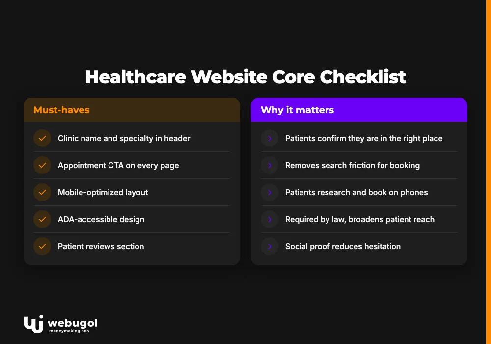
The best healthcare websites share a consistent structure. They load quickly, use plain language patients understand, present credentials and reviews prominently, and put appointment scheduling within reach on every major page. Here is the core checklist:
| Element | Why it matters |
|---|---|
| Clinic name and specialty visible in the header | Patients confirm they are in the right place within seconds |
| Appointment CTA visible on every page | Removes search friction between intent and action |
| Mobile-optimized layout | Patients increasingly research and book providers on their phones |
| ADA-accessible design | Required by law; also broadens patient reach |
| Patient reviews section | Social proof reduces hesitation for new patients |
| Secure patient portal access | Keeps existing patients engaged and reduces staff call volume |
| Fast page load | Slow sites increase bounce before patients see the offer |
Applying these medical website design tips from the start avoids the expensive rebuild that happens when a practice tries to run paid traffic to a site that cannot convert.
What features should a medical website have?
A medical website needs online appointment scheduling, a patient portal, clear contact and emergency information, and content that answers common pre-visit questions. These are not optional add-ons. They are the infrastructure that connects marketing spend to actual appointments. Getting them right is what separates a clinic site from a clinic brochure.
Healthcare web design that integrates these functional elements from the start avoids the piecemeal retrofitting that happens when marketing investment outpaces the site's conversion infrastructure.
Online appointment scheduling
An integrated scheduling system that sends automated reminders and confirmations reduces no-show rates and front-desk call volume. Patients should be able to book, reschedule, or cancel without picking up the phone. The fewer steps between intent and confirmed appointment, the better the conversion rate from visitor to patient.
For practices running any volume of paid traffic, this is where ad spend either pays off or leaks. A campaign driving visitors to a confusing multi-step form consistently underperforms one with a clean, one-step booking widget, regardless of how well-targeted the ads are. Scheduling friction is a tax on every dollar of media spend.
Patient portal UX
Good patient portal UX does more than store lab results. It gives patients access to upcoming appointments, medical records, and secure messaging with their care team. When patients can update personal information and ask questions through the portal, the administrative load on staff drops and patient satisfaction improves. Portals that work reduce calls; portals that frustrate produce them.
The design of the portal matters as much as the functionality. Confusing navigation, broken mobile layouts, or slow load times inside the portal push patients back to calling the office. That is exactly the inefficiency the portal was meant to eliminate.
Patient portals also carry a compliance consideration. Forms and messaging features that handle protected health information require HIPAA-compatible infrastructure: secure transmission, appropriate data handling, and audit-ready access logs. Getting the portal right means getting the security architecture right, not just the layout.
Emergency contact and FAQ sections
Emergency contact information should appear on every page, not only the contact page. Patients in urgent situations should not have to search. A well-structured FAQ section reduces inbound calls for routine questions and improves SEO by targeting the informational queries patients search before booking.
Chatbots and contact forms extend this further, handling after-hours inquiries without requiring staff. For telehealth website design, asynchronous communication features are especially important because the patient interaction happens entirely through the digital interface.
What is the best layout for a clinic website?
The best clinic website layout places the appointment booking CTA above the fold on the homepage and within one click from every other page. Navigation should use three to four top-level categories: services, booking, patient resources, and contact. Supporting content such as team bios, patient education, and blog posts lives deeper in the site but stays accessible through the main menu.
This structure serves both the first-time visitor searching for a provider and the returning patient who needs to access the portal or reschedule. The layout should require no explanation. If a patient has to figure out where to click, the design has already created friction between them and a booked appointment.
Clinic website navigation that reduces patient friction
Clinic website navigation should mirror how patients think about their own care journey, not how the practice is organized internally. Most patients arrive with one of three goals: confirm this clinic treats their condition, book an appointment, or access their records. Navigation that serves those three goals efficiently covers the majority of visitor needs. Healthcare web design that maps navigation to patient intent, rather than to internal org charts, cuts the steps between landing and booking.
Doctor website best practices for navigation:
- Group by patient goal, not practice structure. Services, booking, patient resources, and contact cover almost every visitor need without requiring more than four top-level items.
- Label for patients, not providers. "Book an appointment" outperforms clinical terms like "schedule intake" for the new patient reading the menu for the first time.
- Limit top-level menu items. More than five or six primary categories creates decision fatigue. It increases the time between landing and booking.
- Add a persistent search bar. Larger clinic sites with many service lines benefit from site search. Patients look for their specific condition, not your menu structure.
- Keep navigation consistent. Patients should find the same menu structure on every page. Navigation that changes between sections creates confusion and increases exit rates.
- Test with real patients. Navigation decisions made internally often fail when actual patients try them. Usability testing catches friction before it costs bookings.
Healthcare web design for mobile: what clinics get wrong
Patients increasingly research and book healthcare providers on mobile devices. A site that works on desktop but breaks on a phone loses those patients to a competitor whose site does not. Health website mobile optimization is not about shrinking the desktop layout. It is about redesigning the experience for how mobile users actually behave.
The technical foundations of responsive healthcare web design:
- Fluid grids scale proportionally to screen size instead of using fixed pixel widths. Elements reflow correctly when the browser window changes.
- Flexible images scale within their containers, preventing distortion and horizontal overflow on small screens.
- CSS media queries apply device-specific styles based on screen width and orientation. A mobile layout can reorganize content and resize text without affecting the desktop view.
- Responsive units such as percentages and viewport width keep text legible across screen sizes without requiring separate mobile stylesheets.
- Touch-sized targets. Buttons and links need enough size and spacing to tap accurately on a touchscreen. Small, closely spaced elements produce accidental taps and frustrated users.
- Mobile navigation patterns such as hamburger menus and collapsible sections reduce the navigation footprint on small screens without hiding key destinations.
Poor mobile performance is not just a user experience problem. Google indexes the mobile version of a site first. Weak mobile execution reduces organic rankings, which reduces free patient traffic before any ad spend enters the picture.

How to make a healthcare website ADA accessible?
To make a healthcare website ADA accessible, clinics must meet WCAG 2.1 AA standards: sufficient color contrast, keyboard navigability, alt text on images, captions on video, and form labels that work with screen readers. Medical site accessibility is both a legal requirement and a practical patient retention factor.
The practical steps for ADA compliance on a clinic site:
- Color contrast. Text must have a minimum 4.5:1 contrast ratio against its background, as specified in the WCAG AA standard, to remain readable for patients with low vision.
- Keyboard navigation. Every interactive element, including menus, forms, and scheduling widgets, must be usable without a mouse.
- Alt text on images. Descriptive alt text lets screen readers describe images to visually impaired users and gives search engines additional indexing signals.
- Form label association. Every form field needs a programmatic label, not just placeholder text, so assistive technology can announce the field purpose correctly.
- Video captions. Patient education videos and telehealth tutorial content need accurate captions for hearing-impaired users.
Accessibility audits frequently surface the same issues that hurt conversion for all users, not only those with disabilities. Missing focus states, low-contrast text, and unlabeled fields make the site harder for everyone. Fixing them is conversion rate work as much as it is compliance work.
How to improve patient engagement on a healthcare website?
To improve patient engagement on a healthcare website, focus on three levers: relevant content that answers pre-visit questions, visible social proof from existing patients, and clear calls to action on every page that lead directly to scheduling. The website should do the work of building confidence before the patient ever calls the front desk.
Healthcare web design that surfaces these levers, relevant content, visible social proof, and clear CTAs, reduces the gap between a patient's first visit to the site and their first booked appointment.
Visual design and trust signals
A clean, uncluttered layout builds credibility faster than dense content because patients scan rather than read, and what they notice first is whether finding the booking path requires effort. White space does the work. Specific practices that increase trust:
- Minimal layouts with clear hierarchy. Sparse, well-organized layouts keep the scheduling path visible at all times rather than competing with surrounding content for attention.
- Consistent brand colors. Healthcare sites typically use blue, green, and neutral tones to communicate calm and reliability. Whatever palette you choose, apply it consistently across the site.
- High-resolution clinical photography. Real staff and facility photos outperform generic stock. If stock photography is unavoidable, choose images that look authentic rather than posed.
- Patient testimonials placed prominently. Reviews near the top of key pages reduce hesitation for new patients and support local search rankings, making it simpler for them to find the practice in the first place.
Content strategy for patient retention and SEO
A content strategy built around the questions patients ask before booking addresses the informational intent that shows up in search and in AI-generated answers. Healthcare practices that publish accurate, condition-specific content demonstrate clinical authority and reduce the volume of calls for questions the site already answers. That is a staff efficiency gain and an SEO gain in one move.
Consistency matters here. A site that updates content, fixes broken links, and keeps service information current signals reliability to both patients and search engines. Stale content, removed services still appearing in navigation, or outdated provider bios quietly erode the trust the design worked to build.
Performance monitoring that informs decisions
Tracking how patients interact with the site reveals where engagement drops before it shows up in booking numbers. Google Analytics and Search Console show which pages hold attention, where visitors leave before booking, and which search queries bring patients to the site. Usability studies with real patients add qualitative context that analytics alone cannot provide.
For practices running paid campaigns, closing the loop between ad click and actual appointment requires tracking that extends beyond the site itself. The site must be instrumented to support it, with conversion events firing accurately and attributed to the right source.

When healthcare web design is not enough to scale patient acquisition
A well-designed clinic site is the foundation. It is not the system.
Practices that plateau in patient growth often have a site that looks correct and even performs reasonably on SEO. The gap is in what happens after a patient lands. Slow follow-up. Untracked form submissions. Scheduling friction in the portal. Campaign attribution that cannot distinguish ad-driven bookings from organic ones. These are where growth stalls, not in the layout or color palette.
The diagnostic pattern that appears repeatedly: the site converts fine on desktop, fails on mobile, and nobody has checked. Or the scheduling widget loads too slowly on mobile data. Or the form submission event is not firing to the ad platform, so conversion data is wrong and bidding strategies are optimizing toward the wrong goal.
The site looks fine. The acquisition system is broken.
The latest healthcare website design trends point toward faster scheduling flows, more integrated telehealth pathways, and AI-assisted patient triage on the site. All of these raise the stakes for having a site architecture that connects to your acquisition and retention stack, not just one that looks good in a screenshot.
A clinic owner scaling from one to multiple locations, or a CMO trying to justify increasing the ad budget, needs more than a redesigned site. The site needs to be instrumented: conversion events tracked end-to-end, portal entry and exit points measured, scheduling widget performance tracked against campaign source. That is when healthcare web design decisions stop being aesthetic and start being revenue decisions.
Build a patient acquisition system, not just a website
If your clinic site has the right design but patient acquisition numbers are not moving, the problem is usually not the site in isolation. It is the connection between the site, the ad accounts, the CRM, and the intake process. Webugol's Healthcare Growth System is built around that connection: tracking-first, conversion-led, designed to scale what is already proven. Book a strategy call to find out where your acquisition system is leaking.
FAQ
What makes a good healthcare website?
A good healthcare website communicates trust clearly, makes appointment scheduling easy to find on every page, and loads quickly on mobile devices. The combination of professional design, visible patient reviews, and a low-friction booking path converts more visitors into patients than any single element alone.
What features should a medical website have?
A medical website should include online appointment scheduling with automated reminders, a secure patient portal, clear emergency contact information, and a FAQ or chat feature for common pre-visit questions. These features reduce front-desk call volume and improve the conversion rate from site visitor to booked appointment.
How do I make a healthcare website ADA accessible?
ADA compliance for a healthcare website means meeting WCAG 2.1 AA standards: sufficient color contrast, keyboard navigation for all interactive elements, descriptive alt text on images, and properly labeled form fields. Running an automated accessibility audit is the fastest way to identify the highest-priority issues before a full manual review.
What is the best layout for a clinic website?
The best clinic website layout places the appointment booking CTA above the fold on the homepage and within one click from every other page. Navigation should use three to four top-level categories: services, booking, patient resources, and contact, keeping the path from landing to scheduling as short as possible.
How often should a healthcare website be updated?
Clinic websites should be reviewed whenever service offerings, provider information, or contact details change. Beyond that, structural reviews every six to twelve months help identify navigation issues, broken links, and pages underperforming against their intended goal.

